Clock Tree Architect
Note: At time of writing the application is still in development so images will be blurred.
Role
UI/UX Lead
The Product
The Clock Tree Architect is an Angular Web Application designed for the electrical engineer to formulate an optimized clock tree solution based on their system requirements.
The Deliverable
Bring the project from conceptualization to final UI as a functional prototype for sign-off and development.
Requirements
- Fully interactive prototype built on UXPIN
- Encompasses all features from the documentation
- Meets Texas Instrument's brand guidelines
- Satisfies Material Design standards
- Utilizes reusable patterns and components
Challenges
Early in the discovery phase of the project, two issues became apparent to me:
- The User Interface lacked focus
- There was nothing to visually guide the user to their final outcome
I realized these were the two main areas I needed to focus on addressing in the solution.
Lack of focus in the UI results in difficulty attracting and retaining new customers
Simplifying the User Interface does not mean loss of functionality. The goal was to keep the depth of functionality we had in the product but present it in a way that was intuitive and easy to use. I proposed to solve for this by layering interactions and presenting only the most relevant inputs at any given time.
In order to do this, we needed to:
- Distinguish between which fields are required and which are optional
- Use progressive disclosure by only revealing the options that are most pertinent to the user to reach their end goal
- Reduce the number of empty inputs presented to the user
- Logically group actions that are related to one another in the layout
- Break down each functional element and how they contribute to the final user goal
- Determine if there are any steps dependent on one another
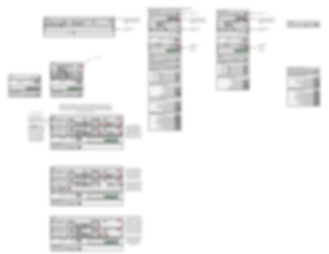
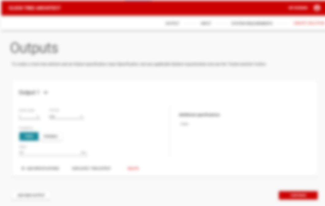
Above screen is the first iteration that isolated only the actions needed for the user to progress to their final goal.
The mockup above makes the additional specifications accessible only on demand by the user, reducing visual complexity in the UI
UI failed to visually represent how the user can get to their final outcome
- Weak visual relationship between the elements and the final user goal in the UI obstructs onboarding, hurting user retention because users cannot establish a mental model for the application.
- No indication where the user should begin
In order to create a better User Experience and successfully drive higher user retention, I needed to address the two problems above that prevented the user from visualizing the journey to their final outcome.
Steppers layout approach
I began with the steppers approach as it was the most overt way to visually guide the user from one step to another. The weakness of this approach was that the final action, was out of view.
Wizard layout approach
Next, I tested out the wizard layout approach. This isolated each step on the screen. The disadvantage was that the other steps were hidden in other screens, preventing new users from creating a mental model for the application.
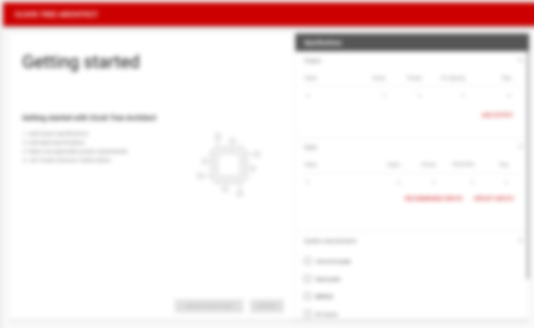
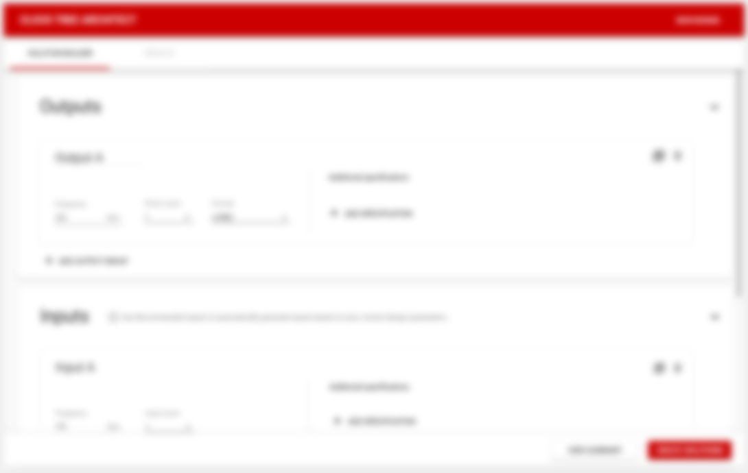
Vertical orientation expandable cards
This was the final approach that we decided on. It succeeded in:
- Leading the main actions to the user goals persistent on the screen in a sticky footer
- Creating visual hierarchy and relationships between elements by containing each group in a expandable card
- Having each incremental step guided by the natural scroll of the page
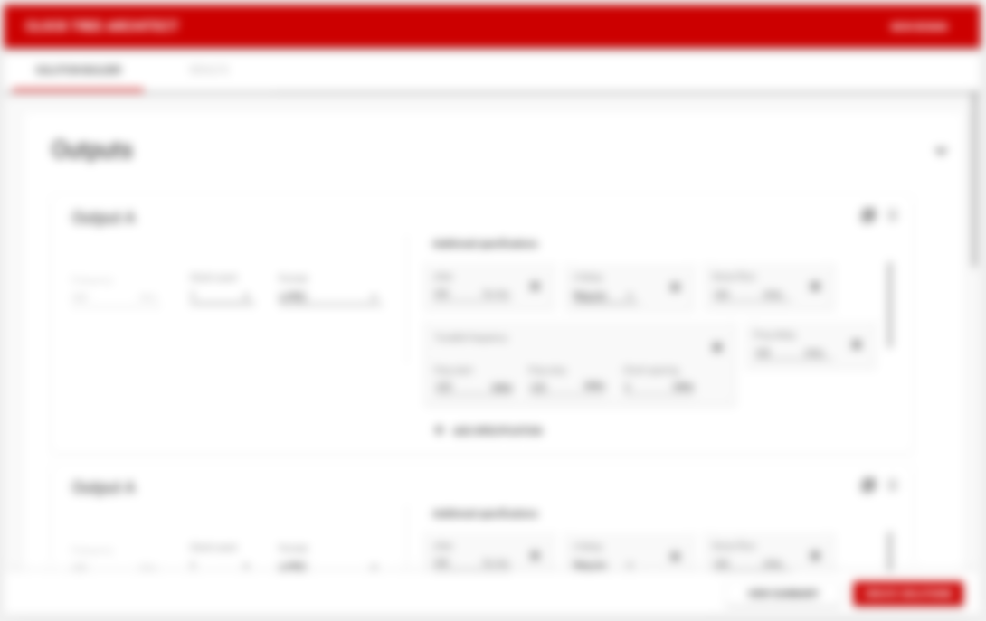
3. Lacking outcome prediction for customers
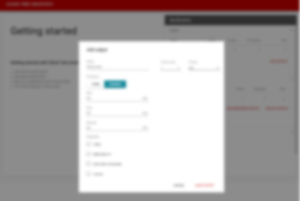
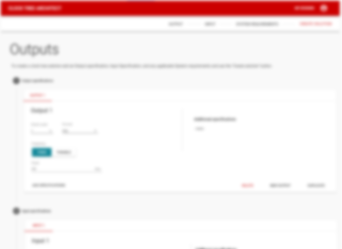
This particular challenge centered around finalizing the UI for how a customer associates applying modifiers to each grouping. The problem was that the customer had no information on predicting how adding each modifier would affect their end solution. We also needed a way to visually show which modifier belonged to which group and give the customer the ability to remove and modify them.
To solve this issue I came up with a main action button that offered a checklist to select multiple modifiers that could be applied to each grouping. They could be dismissed with a standard close icon, as well as contain an input depending on the type of modification. I also convinced the engineering team to provide another descriptor for each modifier as some terms may not be understood by every end-user.

The result
At the end of the project, we had built a fully interactive prototype that encompassed all key user interactions and functional requirements and received a final sign-off from my Product Owner and all the various stakeholders involved (Business analysts and Electrical Engineers). The development is currently in progress for the Angular Web Application.