Carousel web component
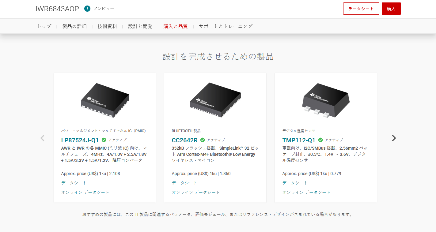
Our team was tasked with creating a carousel web component using StencilJS to present both training content and product information. The completed component is now live for viewing here.
In the process of contributing code and UI/UX to this component, there were many requirements, collaboration across multiple departments, and the consideration that this pattern was intended to be used across different applications.
Companion Products - localized example

Requirements
A key functional requirement that I helped to solve was how the component would interact with touch events to cycle through items. I also established our approach on how the carousel would be controlled and viewed on both mobile and desktop viewports. We needed to ensure:
- The component can be controlled by both pointer events (the mouse) and touch events (a phone or tablet) to cycle through items
- Accepts any child HTML element as a carousel item that is spaced responsively
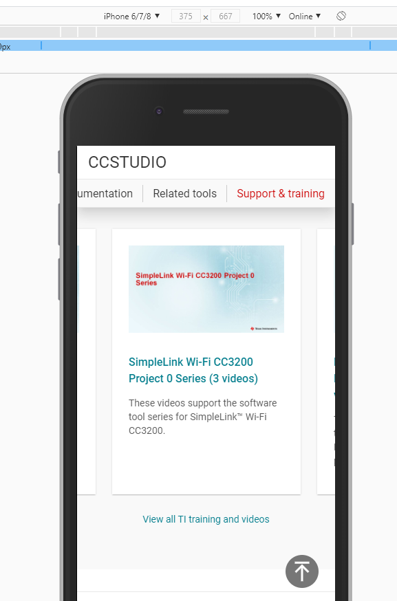
- The introduction of peeking at tablet and phone breakpoints to provide the users with a visual cue for additional content
- The solution proposed is scaleable, responsive, and quickly adaptable to web components
- It could be supported by IE11
- UX requirements were met
- Adoption by Lead Developers
Challenge #1
Handling the interaction between cycling components with touch gestures
During the Proof Of Concept phase we investigated using an external library to handle the touch interactions which added to code weight. This required us manually needing to code how to recognize what gesture the user used and responding to each use case. In addition we would need to tie the UI together by introducing animation to ensure our user has a mental map of when carousel items went off screen. This additional complexity in code makes the components more difficult to maintain and debug.
Identifying that there could be a better solution by leveraging the browser’s native method of handling scroll interactions. I proved that we could meet our functional requirements by restructuring the component’s markup. Coupled with the native support for scroll-snap (CSS aligning each element and snapping to position), we could simplify our approach, no longer needing to wire up animation as well as create logic to handle touch interaction and manual positioning of items within the carousel container.
This reduced code weight and simplified the component considerably that utilized this pattern.
Challenge #2
Getting adoption
The next step was to move the project into development. I worked with the lead developers to help them understand the CSS solution, using responsive proof of concepts to help communicate the idea and its requirements.
The developers were excited about the solution and its simplicity. After its implementation, I shared it with the UX team to align on the solution as a reusable pattern across all similar responsive touch and interactivity needs.
Challenge #3
Securing UX Design decisions
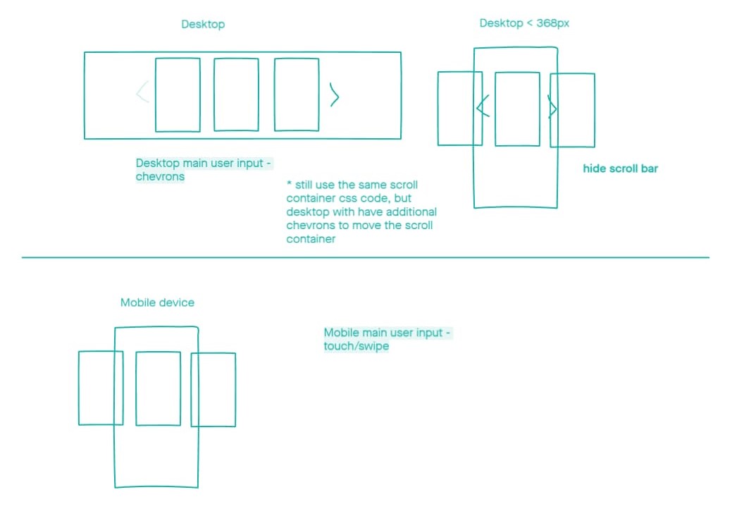
I was able to propose, iterate and secure a UX decision from our UX Designers and Creative Director to move forward with development by using low-fidelity wireframes to demonstrate how we can handle:
- presenting the items in the carousel responsively across different devices
- how much of the last item should remain in view across mobiles devices to offer a visual cue for customers to know there is more content
- where to position the controls so it aligns with our grid as well as accessible on mobile devices

Results
In the end, we were able to achieve a lighter code that was native to the browser and much easier to maintain. The development team adopted the CSS approach for this pattern across responsive components in related patterns. This increased overall performance and reduced code complexity. I was also able to keep the development process moving by proposing and securing decisions on UX gaps early on in development. See it live here on your phone/tablet/desktop/IE11: here

